Saturday, December 18, 2010

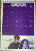
Final Project - Calendar

Intention: I made the calendar for my mom's, grandma's and aunt's Christmas presents.
Target Audience: My mom, grandma, and aunt
Price for each calendar: $10.65
Special elements:spiral binding


Thumbnails

Thumbnails


Roughs 


Rough


front cover


Friday, December 3, 2010

Variable Data

BACK
FRONT


TARGET AUDIENCE:
       Males and females bowlers over the age of 21


ASSIGNMENT:
   8x5 four color two sided postcard

CALL TO ACTION:
   Drawing attention to our available leagues


Thursday, December 2, 2010

Publication Ad


TARGET AUDIENCE:  
               Men and women wanting to join the National Guard
CALL TO ACTION:
                 Advertise the National Guard
                  Get people to join the National Guard
           

Wednesday, November 17, 2010

Four States Regional Conference

      The session I went to for the conference was Social Media- Instruction on Emerging Tools to Do Business. The speaker for this presentation was Wells Hall. Mr. Hall told us a lot about how social media works and how it can change people's lives. When applying social media there are five key steps to do; plan, listen, participate, evaluate, and respond. One of the biggest online companies right now is twitter. We talked about how Twitter is such a success because it gives people a voice. They are able to voice their opinion and communicate what they want without being held back to a certain extent.
     We also talked about quite a few people who have had life changing moments due to social media. One of the people who we talked about was Susan Boyle. On April 11, 2009 she woke up as a no body and by that night her face was all over Youtube.When people first saw her on Britain's got Talent people were thinking that she should not be on the stage but, once she opened her mouth everything changed. Some people were crying by the end of her song. Youtube gave those people the power to share with everyone the wonderful thing that they had just witnessed. By November 23rd, she had released her first album. 
     I learned a lot from the session. It made me more interested in social media. I knew it played a big part in online things but, I did not realize how fast it can change a persons life by either making them famous or tearing them down.

Monday, November 1, 2010

Newspaper Ad

For the newspaper ad I was advertising a rock/metal music festival. My call to action was to show up or RSVP if they were wanting a chair. For my target audience it was a family event for part of the day and then the rest of the night it was 18 and older. I had a $100 budget and spent $76 all together for my 2 ads. 

PRODUCTION SCHEDULE:
 
  October 7: Ads assigned
  October 12: Thumbnails, roughs, and specifications due
  October 14: Ad approval 
  October 18: Edits and revisions due
  October 21: Final approval
  October 28: DUE DATE

Formula: 3 x 3 = 9 x $4 = $36
Ad Price: $36 each
InDesign Dimensions: 5.75in x 3in


                            1st ad thumbnails

               2nd ad thumbnails

 
1st ad rough draft2nd ad rough draft 
 1st AD                                                     2nd AD 


Tuesday, October 26, 2010

Brendan Murphy

   "Nowhere leads to somewhere" was one of the quotes that Brendan Murphy said that stuck out to me the most. Murphy is a Pittsburg State graduate came back to Pittsburg last week and shared with us some very important and useful information.The information had to do with the graphics industry and how it works. He also gave us some pointers on what we should do while we are still in college to make sure we are ready for the real business would when we graduate.

   Brendan's background was one that I found interesting. A lot of things he told us I have never personally experienced. With that said it made me realize that if he can make it though college than I can too. Brendan and I do have one thing in common when it comes to school and how we approach things. We both always seem to take the long way to something.

   One thing that stood out to me most was what he said about writing. He told us that writing is one of most important parts of his job. Yes he is a designer but, most of the work he does is writing. I have never been a good writer nor have I ever liked writing. But, after him telling us this it has made me realize that I need to start working on my writing skills so that it will not hurt my chances on getting a job in a couple of years.

   I learned a lot about what all goes along with being a graphic designer. I mean I have taken the class but, it was one of those things that you do not realize how much work goes along with it. He told us that for just one design he comes up with about 3,000 sketches. I could not believe it. They do all those sketches just to be able to come up with one final design because you never want to introduce something until you know it is going to be successful.  Another thing that he said is that when it comes to dealing with logos it is like dealing with politics. Just like how politics are consistently changing so is world of graphics and what people are looking for. Designing is a constant continuation because the world is always changing. Like I mentioned earlier the success of a logo is very important.  The way that his company measures success is they ask their customers how they will be measuring it. I like the way they do that. It makes sure that both the client and the business are on the same page and helps the business come up with an excellent design.

   Brendan's presentation was one that really opened my eyes. It opened my eyes to how important writing is and how much work actually goes into designing logos. The designing process is not as easy as it seems at times.  With some logos and designs there come risk of total dissatisfaction and others are very successful and appreciated.


Monday, October 25, 2010

Gap logo

Who knew that a company changing their logo would cause such an outcry? Gap's logo change affected their customers more than they expected. Gap reported that their reasoning for changing their logo was to go along with their new line. The clothes are going with a more modern look and they thought their logo should too.

within a week of putting out the new logo they had thousands of people reacting to it. None of the feedback they recieved was positive. Customers could not believe they changed the logo was much as they did or at all. In return from all the negative feedback Gap decided to bring back the old logo and completely get rid of the new. For once with the economy changing as much as it is something new was not a good idea. 

The new logo was uninspiring, boring to look at and just made the company in my opinion look bad.  Outsiders are saying that they should Have  gone with a real designer instead of using Microsoft to create it. Microsoft has good fonts but, not always the right one you are needing. The font they picked was boring, the color scheme was boring and it does not look like a logo for a clothing brand.

According to Amanda Elswe from Penn State, "The new logo is perfect for the brand. It communicates exactly the values currently embodied by Gap: A sense of being lost and a lack of clear vision and creatively." In the recent years, Gap has seemed like they are in foggy situations, and lost state of minds.

Gap has learned a huge lesson from this experience. One thing that they have learned was that they should have worked with their customers to make a new logo. They need to allow the customers to give their advice and say about the change. Another thing is that they should have explained the reason behind the change of the logo. By the time the company got around to explaining it it was already too late. 
Oliva Dayne, Gap spokeswoman said, "that changing the logo was the next logical step in their redesign plan. The logo was developed internally and wanted to keep the heritage of the blue box, butbring Gap to the forefront." 

In my opinion, this new logo is one of the worst I have seen in a while. To me it looks like a logo for a corporation that involves insurance or something along along those lines. Logos for brands should make people want to go to your store and buy your clothes, not make them stay away. I understand that Gap wants some change to their logo and fashion line but, I just do not think it is the right time for the change. Or, if they were really determined for some change they should of made the logo about the same but, add a  picture or change the font. Another thing I do not understand is if the company is losing money as the months go on then why would they spend tons of money changing their logo? I tried to find about the financial aspect of the change but, was unable to find anything. 

In the end Gap has learned a huge lesson. Before they made changes they should consult with their customers and the rest of the public. They should survey the public to see if the company should make any changes. Another thing is rethinking their strategy before wasting a ton of money for a new logo when they are already losing money from their clothing sales.